Brainstorming for next semester

We had a small end-of-semester event to brainstorm what we might do next semester and beyond. So many great ideas were shared– this could fill our color-time for the next two years! Be on the look out for many of these as topics for future Chromatic Cabinet events. If you have any ideas for future events please send an email to colorspace@swarthmore.edu- we are always looking for new and interesting things to talk about!

Autopoisis: from color perception in pigeons to a new systems perspective

Color as taste (exploring guide books on kimono colors and Western wallpaper)

Hume (on blue)

Goethe vs Newton’s theories of color

A series on black: tech and perception/blackness/semiotics/race theory/images of black holes/vanta black

PMA field trip (visit the archives?)

Is there a color of inclusiveness and is it purple?

Using color in linguistic maps

Color in maps in general (and the associated mathematical problem of coloring maps)

Wavelengths of light related to plants and photosynthesis

Color revolutions

The colors of war flags


New York Trip

We visited several places in New York on Saturday November 12th. Some highlights and related links can be found below.

The Kremer Pigments homepage outlines their offerings, including raw pigments for art and conservation, historic and modern pigments, mediums, binders, dyes, vegetable color paints, oils, brushes, tools etc. The Instagram page for Kremer gives you a sense of what we might see in person.

We will visit the studio of Suzan Frecon to have a conversation about color! Here is Lawrence Rinder writing on Frecon in FillipAnother nice preparation for our visit with Suzan is the the interview between Suzan Frecon and Marcella Durand in Parkett. Additionally, there is a nice walkthrough of her 2015 exhibition at David Zwirner Gallery.

We will also have the chance to visit three current exhibitions in Chelsea on Saturday, all related to color. Josef Albers at David Zwirner Gallery, Ivan Navarro at Paul Kasmin Gallery, and Richard Anuszkiewicz at Loretta Howard Gallery.

Here are some color related pictures from our trip:

l1024699 l1024703l1024743 l1024705 l1024713 l1024718 l1024724 l1024736 l1024740 l1024752

Oil and rain

l1024847

Oil and water might not mix, but if you place a small drop of oil on wet pavement you will get a symphony of color. You’ll find oil slicks, like the picture above, on roads after it rains.

The physics behind these colors is also the physics behind the colors of butterflies and other iridescent insects:

Since oil and water don’t mix a thin film of oil develops on top of the wet pavement. Whenever light travels from one medium to another (air to glass for example) some reflects and some is transmitted.  In this case we have two places where light is reflected: some is reflected at the air/oil interface and some is reflected at the oil/water interface. If the thickness of the oil layer is equal to an integer multiple of the wavelength of light then the two reflected parts add up (constructively interfere); if it is equal to a half integer multiple the two reflected parts cancel (destructively interfere). Therefore, the color of the slick tells us something about the thickness of the film of oil! The bluer parts are thinner (~400 nm), the reder parts are thicker (~700 nm), and finally when the slick becomes even thicker it appears a silvery-white!

??????

A nearly circular oil slick

Looking at the above picture we can see that the oil slick is thinnest at the center gets thicker as we move outward…. Although, as I write that, it seems weird to me.  If we imagine a drop of oil on water it beads up- with the thickest part in the center! It would be fascinating to understand why this thin slick seems to have the opposite behavior.

Blue (Meeting Friday Dec. 2nd from 4-6)

color_order

It is well-known that color words appear in languages in a particular order.  We’ll discuss one of the landmark papers that established this fact: Color-term evolution and order (1969).  If you are interested in a more up-to-date study see Key et al. (1999).

After spending about an hour discussing color terms and language we’ll (start to) make our own cyanometers (this activity was suggested by David Cohen).  A cyanometer is a collection of different blue color chips (usually arranged in a circle) which can be used to ‘quantify’ the color of the sky.  It was instrumental in developing a physical answer to the (literally) age-old question: “why is the sky blue?”  If you are interested in the history of the answers to this question see the History of explanations of the blueness of the sky .

Suzan Frecon’s studio visit: an artistic Monte Carlo

sedate

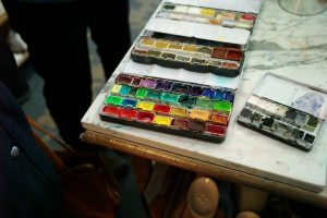
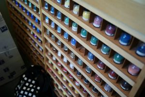
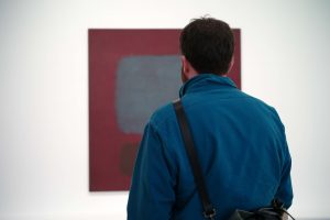
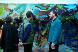
Our visit to Suzan Frecon’s studio was much more than a conversation with a painter concerned with color.  She opened up herself and her studio to a group of people with diverse interests: physics, astronomy, art, literature, and writing.  She engaged with all of us, touching on: the temporal nature of color, the role of story versus experience in her paintings, the way in which the setting sun opens and closes the spaces in the paintings hanging on the walls of her studio.  Suzan was an amazing host, ushering us from one room to the next, helping our eyes to follow the setting sun.  Her studio was strewn with graph paper sketches of her paintings, jars of fresh pigment, paperweight rocks, and a select group of books open to pages showing a diversity of images.  It was a magical space and Frecon was a spectacular guide.

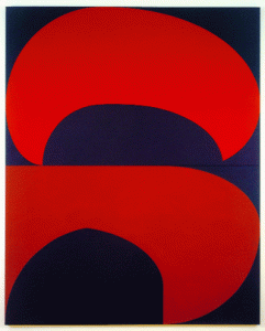
I was particularly affected by her discussion of one small painting, made on a slab of wood.  It comprised two red shapes floating on a blue background.  The painting we saw was a study for something larger.  As she told us, it started with a basic idea: two red shapes on blue, each of equal area.  The bottom shape came quickly- the top, on the other hand, took much more time and work.  After 50 tries Frecon got it- sketched out, she knew it was a perfect complement.  I have been a bit obsessed with this story (and the image of her painting) ever since.

Art is typically a game played by those with egos- or at least I have convinced myself of that.  How else could I understand the ‘choices’ apparently made in the objects and images produced by artists? A ‘finished’ piece of art is an assertion of power, of vision.  I have always imagined that this assertion is not done though calm contemplation and in hushed tones, but instead it comes out forcefully, in screams- it is the vision of the artist as a projection of a strength of will- only though a crazed and strong personality could a person convince so many others to consider their vision as the vision.  Frecon’s description of her process in making this painting challenged this picture.

First, her insistence that the two red shapes have the same area. I still wonder: is this something that the eye can see?  What if the areas were only crudely equal?  But, seeing the graph paper and sketches in her studio, I imagined a painstaking process making sure that each of her 50 trial curves outlined exactly the same area. What did those other thrown-away shapes look like? What did they lack that this one has? Frecon’s seriousness, warmth, and openness convinced me that whatever they looked like, whatever they lacked, it was for a real considerate reason that they were rejected.

The description of her process reminded me of one of the main tools of my trade: Monte Carol Markov Chains.  It is an automated process which explores the agreement between a theoretical model described by a set of parameters and a data set.  At each point in the chain the parameters of the model take on a certain value and the model’s predictions are compared to the data set.  The parameters are then (randomly) changed to other values and the comparison happens again- if the predictions better match the data then the chain moves to this new point; if the match is worse, the program tries a new set of parameters.  The key is that we have a quantitative way to compare the model’s predictions to the data set- a metric- called the chi-squared.  As Suzan explained her 50 trial shapes I imagined a creative chi-squared pre-programed in her brain, each time checking the trial against her innate data set which defined the ideal second, equal-area, red shape floating over a liquid blue background.  Hers was a rigorous process that elevated a personal sense of what is aesthetic from an opinion to a fact.